
Keiss Property
Visual Identity
Keiss’s brand identity makes them stand out in a competitive design landscape without being overly rigid or corporate. At the same time, the identity reflects its coastal Gold Coast context in a bold and colourful way.
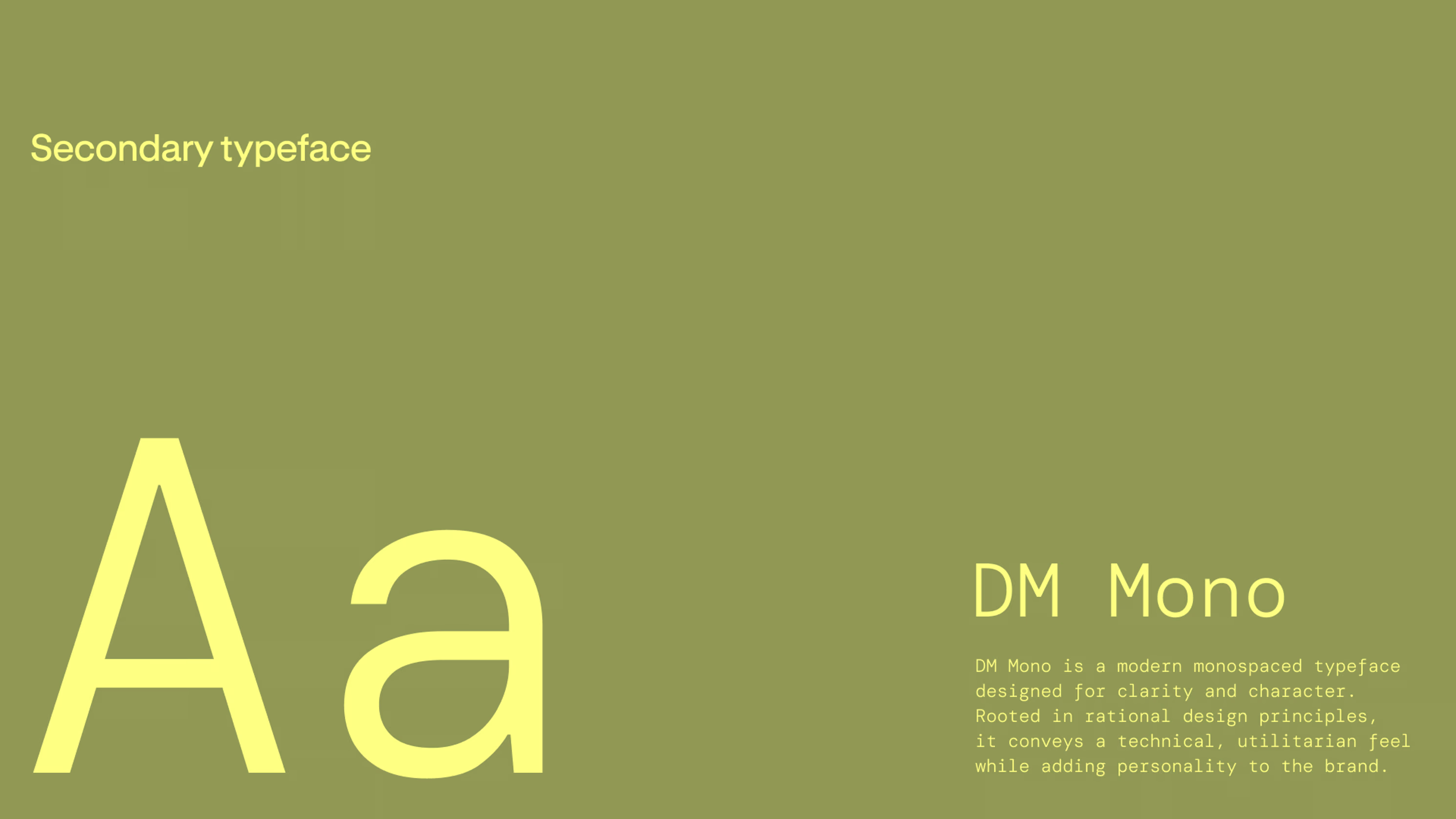
A dynamic logo shape makes the identity unique, working both as a mark and as a graphic device across layouts. The brand’s typography strongly anchors the visual language by providing both impeccable function and style.




I acknowledge the Traditional Owners of country throughout Australia and recognise their continuing connection to land, waters and culture. We pay our respects to their Elders past, present and emerging.